Weather Forecast Streaming Data Analysis
How accurate are weather forecasts actually and what weather model performs best for different places in Switzerland?
To answer these questions, Leo Posva and I developed a streaming data analysis pipeline relying on Apache Spark and Hadoop. The pipeline allows us to visualize the accuracy of recent weather predictions in real-time in a manner that can easily be scaled up for Big Data. The project was completed as part of the fantastic Data Information Systems master lecture.
Pipeline Architecture
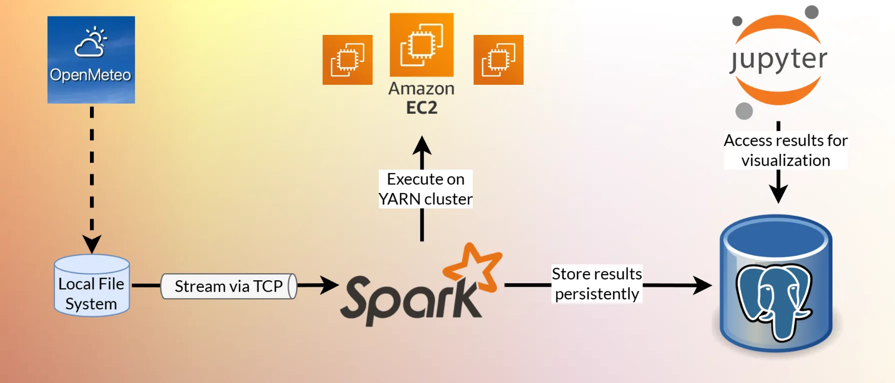
The developed data processing pipeline architecture is shown in the cover image. It was deployed on multiple AWS EC2 instances.
Data Collection
Data is periodically fetched from the free Open-Meteo API. The processed forecast data
- comes from 4 different weather models,
- for 10 locations across Switzerland,
- makes hourly predictions for up to 7 days into the future
- and includes the variables temperature, relative humidity, surface pressure and total cloud cover.
In addition, we also record the actual measured values for these variables, allowing us to quantify the forecast accuracy.
Data Processing
The collected data is continuously streamed into the Structured Streaming engine of Apache Spark. Spark runs on a YARN cluster on top of 3 Hadoop nodes.
After cleaning and mapping the data to a tidy table, the next step is to group forecasts and measurements by their target time. This was implemented as an instance of a stream-stream join and required watermarking.
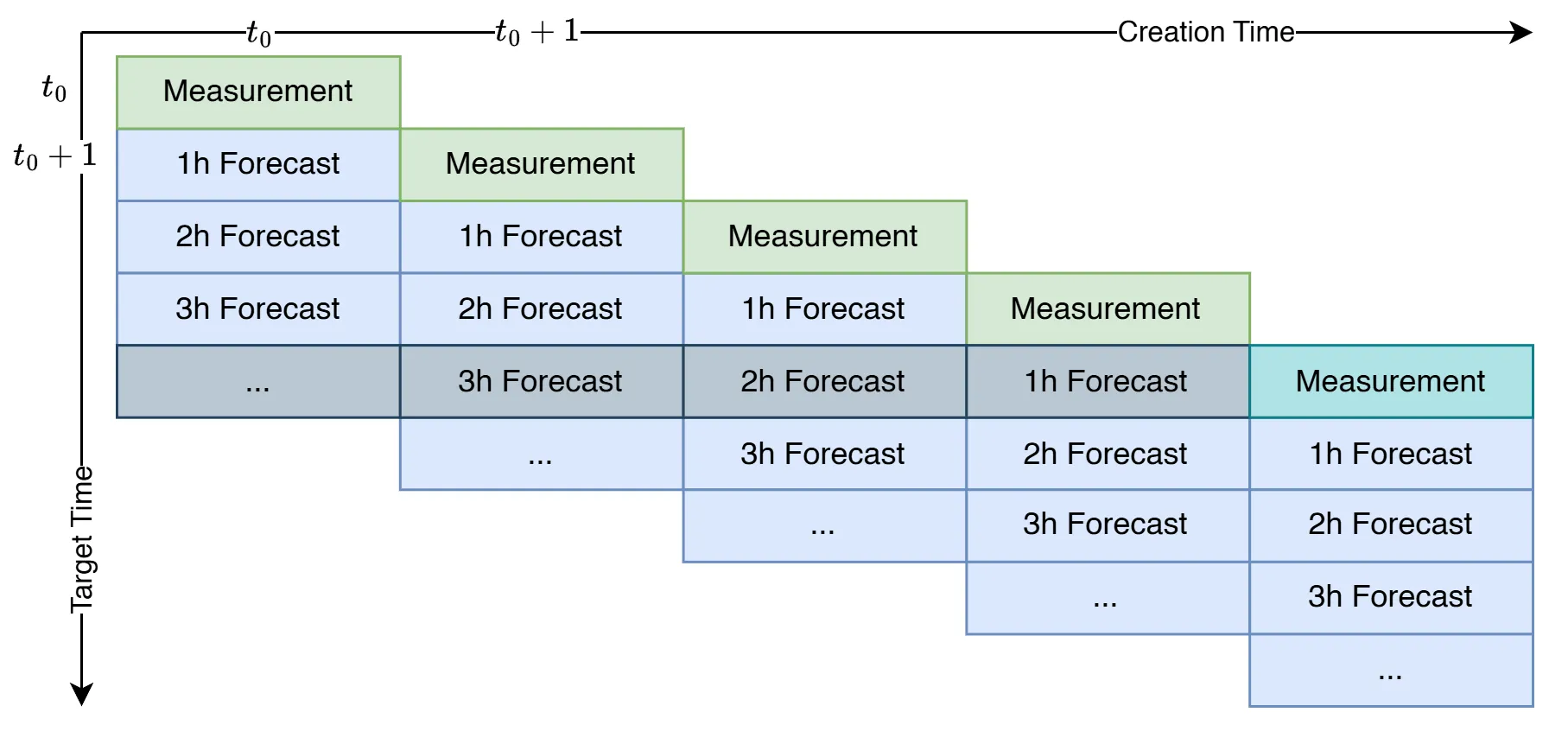
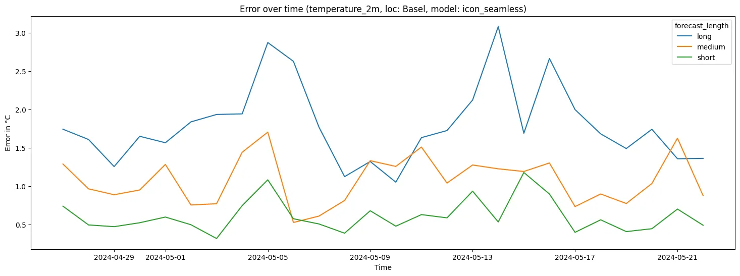
A windowed grouped aggregation on the target time is performed. This computes the average error per day for each combination of location, model, variable and forecast length:
- short: forecasts up to 1 day into the future
- medium: 1-3 days
- long: 3-7 days
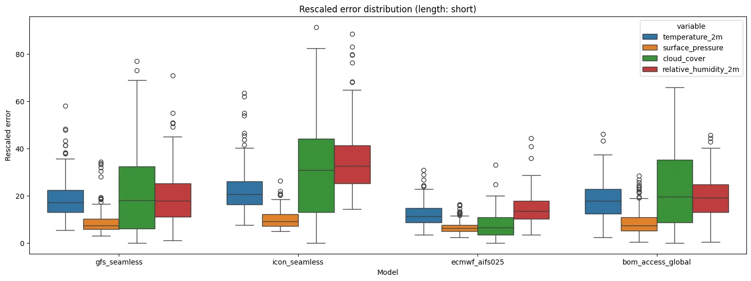
Finally, we add a rescaled version of the errors (97-th percentile is mapped to 100) that makes the different weather variables comparable. The results are incrementally written to a PostgreSQL database.
Data Visualization
We used the Python data visualization library seaborn to visualize the results from within a Jupyter Notebook. Additionally, Jupyter Widgets were used to make the plots interactive.
Using Voila behind a nginx web server, the interactive notebook was turned into a standalone application that can be accessed from anywhere over a web browser.
Results